Ecommerce has witnessed a boom over the past 24 months, and it’s not slowing down. Insider Intelligence forecasts online shopping to reach an impressive growth rate of 13.7% over 2021. And Statista predicted that as many as 2.14 billion people (27% of the world’s population) bought products online.
But the fact is, with dramatic growth comes a series of challenges.
In a world where trust is a disappearing commodity, it’s becoming increasingly difficult for brands to convince consumers to convert. Just the fact that the average cart abandonment rate falls at a whopping 69.80% shows the importance of addressing (and preventing) buyer fears. Fortunately, however, there are ways to positively sway your audience’s decision-making process by minimizing fears and worries. The following are the six top buyer concerns you need to address on your website to do so (and boost conversions in the process).
Is this business for real?
One of the most important things you need to do if you are to nip conversion-killers in the bud is to invest in the branding of your business.
More precisely, you want to position your brand as an authority in your niche and a reliable resource for high-quality products, services, and information.
So, how can you do this? Well, there are several excellent strategies to boost your brand’s standing in the eyes of your target audiences.
1. Invest in web design
Research shows that aesthetic design plays a key part in forming web visitors’ first impressions of a brand. A study published in 2020 found that websites that looked “attractive and contemporary” resulted in a considerably higher level of consumer trust than websites that looked “dull and outdated.” Moreover, the paper presented a visual design checklist, which included the following tips:
- Professional design
- A color scheme that suits the product/service
- Legible typography
- High-quality, original visuals
- Good on-site search
- Easy-to-use navigation
- Clear anchor text and microcopy
- No technical problems.
Now, the aesthetic direction you take is going to depend on your brand and target audience. After all, different age groups and even nationalities have various preferences when it comes to aesthetics. (People from Scandinavian countries, for example, prefer minimalistic, monochrome websites). So, your job when trying to boost conversions with visual branding is to identify what your audience loves (and what suits your brand), then emulate it on your site.
Klättermusen does it wonderfully well with a utilitarian approach that captures the thrill of mountaineering while still providing a great visual experience.

2. Have an active social media presence
In addition to paying more attention to how you design your website, it’s also essential to understand that people will be looking at your social media profiles to check if you are a genuine business. SproutSocial’s The Future of Social Media Report for 2021 states that 62% of consumers agree brands must have an active social media presence unless they want to be left behind. Moreover, the report points out that as many as 55% of consumers use social media to learn about brands and that one-third of people use it for product discovery.
The great thing about using social media to prove the authenticity of your business is that you don’t need an overly complicated strategy. According to Hootsuite, it’s enough to publish 2-3 posts to your Instagram feed per week. That leaves you with plenty of time to come up with valuable, engaging content.
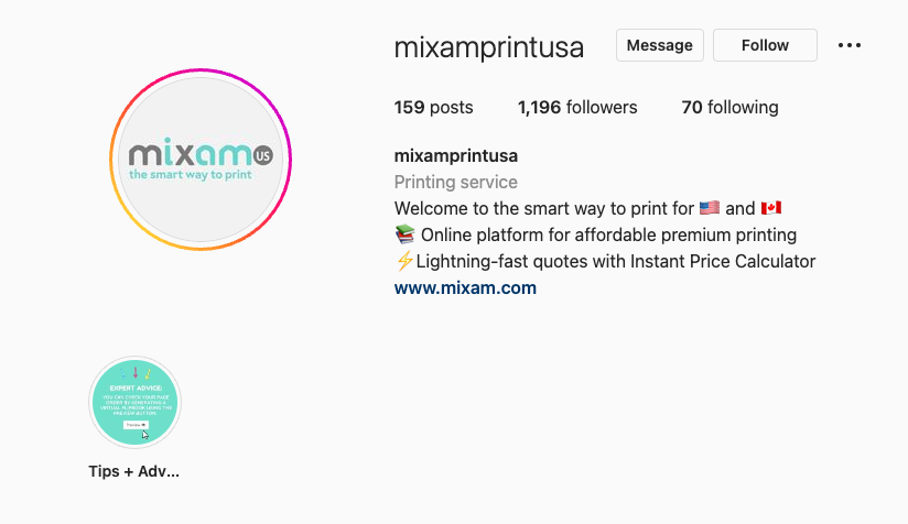
To see an example of a brand that does precisely that, check out Mixam. This brand’s Instagram feed features a combination of customer highlights and actionable advice. This has helped create a profile that serves both as a beautiful discovery tool and a collection of testimonials proving that Mixam is the real deal.
As you focus on content distribution (and this goes both for social media and your blog), don’t forget to interact with your followers. Replying to comments, answering questions, and keeping a check on your DMs will ensure you never miss an opportunity to capture a lead and send the message that you’re a serious business that’s 100% committed to keeping its customers happy.
3. Provide contact information
Another super-important thing you have to do is to make it clear that your brand exists in the “Real World.” The aim is to prove that your business is for real and not just another short-lived online project. Some easy ways to do this include:
- Providing your physical address on your website’s footer (or on a dedicated Contact page of your site)
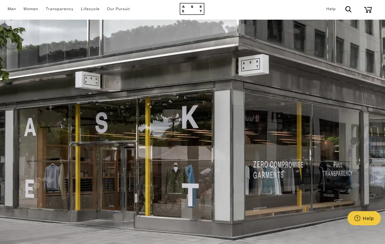
- Showing pictures of your physical store locations, as (beautifully) done by ASKET
-
Introducing your staff and showing it in action, as done by GoCo

-
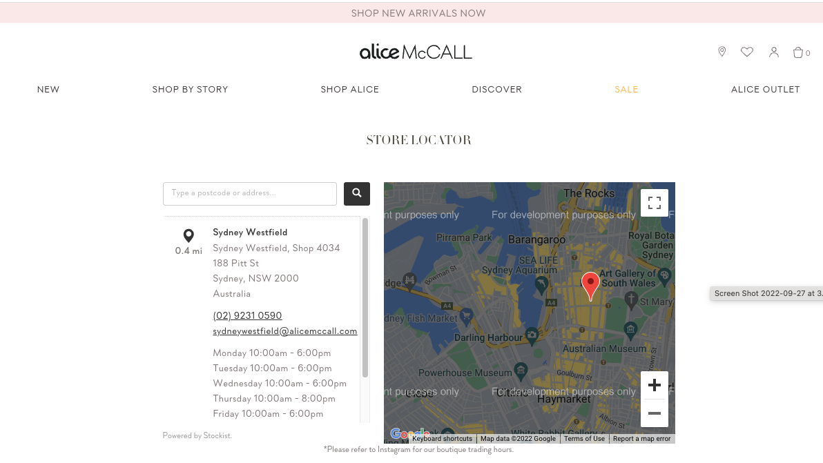
Including a branch locator feature to help international customers get in touch more easily, like on the Alice McCall website.
4. Be available
Finally, in addition to making it possible for potential buyers to get in touch with you, don’t forget to also make it convenient. Yes, publishing your address, support email, and phone number is an excellent way to show that your business is genuine and committed to providing exceptional service. But, you can always take things a step further. See if you can implement solutions such as live chat on your website. Or, consider whether it might be a good idea for you to provide customer service through your social media profiles.
Microsoft’s 2020 Global State of Customer Service report found that 54% of consumers had a more favorable view of companies that replied to customer service questions through social media. That’s a statistic worth noting when you’re trying to build trust for your brand. Lastly, don’t forget to make it clear that you want your potential customers to contact you.
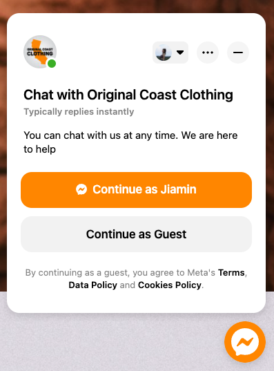
Orizaba Original does this well on its Facebook page, using nothing more than the built-in Messenger widget. By formulating one of the CTAs as “Can someone assist me,” the brand is opening its doors to potential customers. They’re building a successful relationship even before people have had the chance to consider whether the business is for real.
Is it safe for me to shop here?
The internet isn’t exactly the safest place for consumers to shop. In 2020, as many as 86% of global consumers fell victim to identity theft, credit/debit card fraud, or a data breach, according to OpSec Security. And a 2021 survey conducted by Entrust reveals that as many as 79% of consumers are at least somewhat concerned about their data privacy. Furthermore, people are growingly aware of the problems with online payments, with as many as 45% saying that fraud is an inevitable risk of purchasing through the internet.
So, if you want to remove buyer hesitation and boost conversions on your ecommerce website, you have to ensure that your brand does everything in its power to keep buyers protected.
4. Pay attention to transactional security
One of the crucial aspects of reassuring your web visitors that your store is a safe place for them to shop is to ensure that each transaction performed on your site is secured with multiple layers of protection. This means that you should:
- Purchase an SSL certificate to keep all the data on your site encrypted.
- Use multi-factor authentication for user login.
- Set up a powerful firewall system.
- Keep your antivirus program up to date.
- Regularly maintain payment security. (This checklist from the PCI Security Standards Council is a great resource.)
5. Address how you use personal information
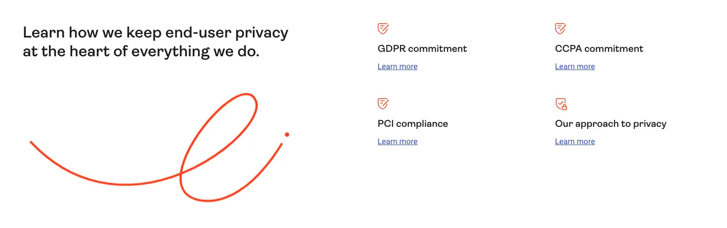
Another great way to reassure web visitors is to be explicit about how you plan on utilizing the personal information they give you. Do you intend to use any of their contact info for marketing purposes? If they sign up for your newsletter, do they get insight into what you will do with the provided data? Do you allow your web visitors to choose what cookies they consent to? (Note that many countries have strict regulations about privacy protection, with GDPR and CCPA being the most famous ones. This means that you are bound by law to keep customer info safe.)
And, if consumer safety and data privacy are a core value of your ecommerce business, don’t forget to show it. Even something as simple as the microcopy in Allude’s newsletter signup form can help you show that you’re a trustworthy brand people can shop with without having to fear being bombarded with intrusive marketing.
6. Use trust signals
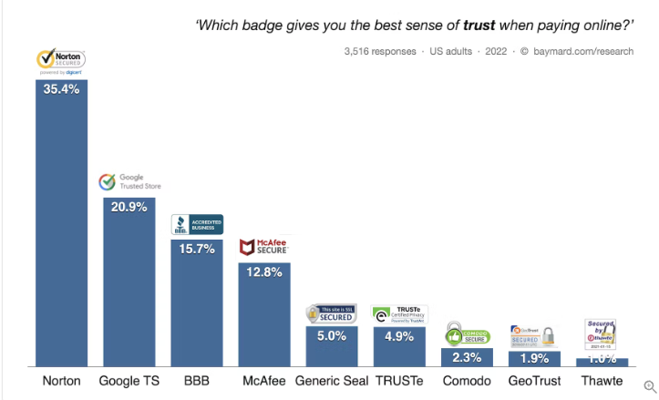
Finally, don’t forget that what you say isn’t always enough to convince your target audience that you’re serious about your claims. Consider adding some trust badges to your site and using them to reinforce your brand’s trustworthiness (and boost sales). A 2021 survey from the Baymard Institute found that consumers had the most faith in SSL certificates. This was followed by trust badges by brands like Google Trusted Store or TRUSTe. Moreover, the test results from Baymard revealed that Norton led the race amongst third-party certificates. As many as 35.4% of consumers stated that Norton’s badge gave them a sense of trust when paying online.
Will I be satisfied with this product?
According to the State of Consumer Behavior Report from Raydiant, 46% of people prefer shopping in person rather than online. The main reason for this is that physical stores allow them to view, touch, and interact with the products.
In other words, a considerable portion of people prefers physical stores because products bought online don’t always live up to their expectations. So what steps can you take to manage consumers’ expectations better (and ensure they’re happy with their purchase)?
7. Build exceptional product pages
One of the easiest ways to ensure your web visitors know what they’ll be getting is to build better product pages.
-
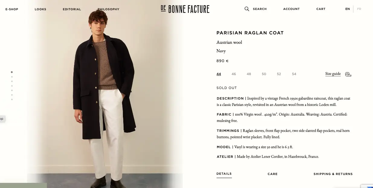
Use descriptive product names that help visitors know what they’re looking at. For example, De Bonne Facture includes info about the materials used in each garment. This helps them ensure that web visitors know what to expect even before looking at a product page.
-
Write better product descriptions. Address consumer pain points, answer common questions, and give as much detail as you can. Plus, back everything up with photos and examples. Rain or Shine Golf does this well, explaining in detail everything that users need to know before buying one of its golf simulation products. The company specifies what devices buyers will need, space requirements for setting up the system, app features, setup instructions, and everything else.

-
Use high-quality visuals. Provide as detailed a view as possible, and don’t hesitate to include videos or 3-D product previews on your site, as done by Jaeger-LeCoultre.

- Keep your product pages up to date with all the info your buyers may find relevant, preferably with an automated solution like Plytix Product Information System (PIM). Keep web visitors informed about availability, changes in product quality or fit, shipping delays, etc. Being transparent is always the best way to win buyer confidence, so make sure that you’re putting the customer experience first – even if it means a bit more work for your team.
8. Include product reviews on your site
Another excellent way to promote assurance in your brand is to include product reviews on your site and product pages. According to a 2017 survey conducted by Statista:
- Only 2% of consumers don’t find product reviews impactful when making purchasing decisions.
- 19% of people feel that testimonials are extremely important.
- 38% think that they’re very important when deciding what items to buy.
Lokalise does a great job of showing off user opinions to boost conversions and remove buyer hesitation.

In addition to displaying a hyper-relevant testimonial from Revolut’s Chief Mobile Officer (which mentions specific features his company benefited from), Lokalise also shows off its G2 and Capterra ratings. The brand knows that these are authoritative sites in the SaaS community and that visitors will appreciate the niche-specific info.
9. Show off niche accreditation
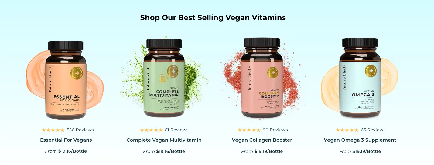
Are you targeting an audience with unique pain points and requests? Well, it might not be a bad idea to show off your brand’s niche accreditation. This will testify to your company’s capability of meeting user expectations. For example, health enthusiasts who care about environmental issues will be delighted by the hero section on the Future Kind website. It communicates that the company:
- is a B-Certified Corporation
- makes its products in the USA
- is 100% vegan
- donates $15,000 to sanctuaries
- uses eco-friendly packaging
10. Back up your claims
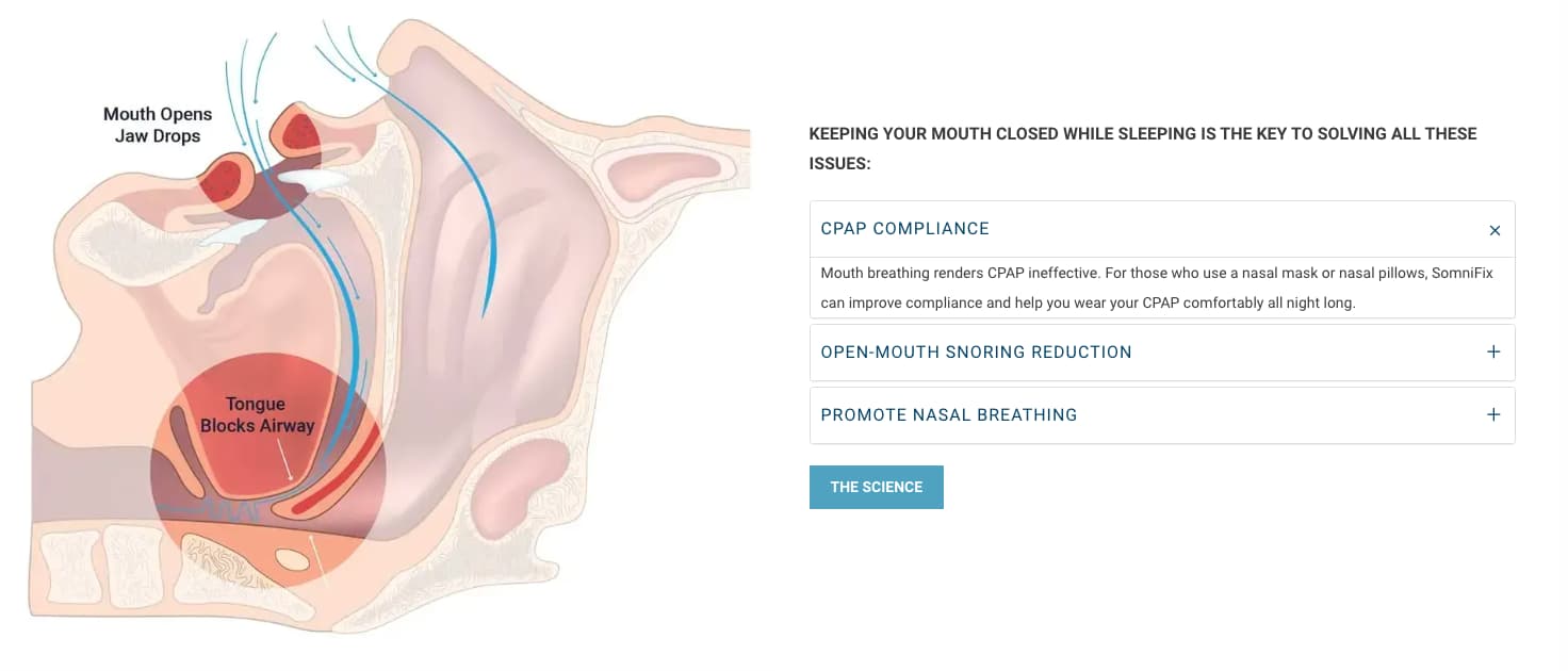
If you’re ever in doubt whether you’ve made your value propositions believable enough, know that you won’t go wrong with providing proof to back up your claims. Is there specific research behind the results you promise? Link to it, as done by SomniFix.
Have you tested your products to check their effectiveness? Describe that process and share the results, as HotJar does on its Case studies page.
Readily sharing proof to support your claims is an excellent way to overcome buyer fears. And even if your web visitors don’t convert right away, they will walk away from your site knowing that your brand is trustworthy and a safe investment for their needs.
Am I going to be surprised by hidden costs?
According to Statista, 17% of consumers abandon their carts because the website makes it difficult to see/calculate the total order cost up-front.
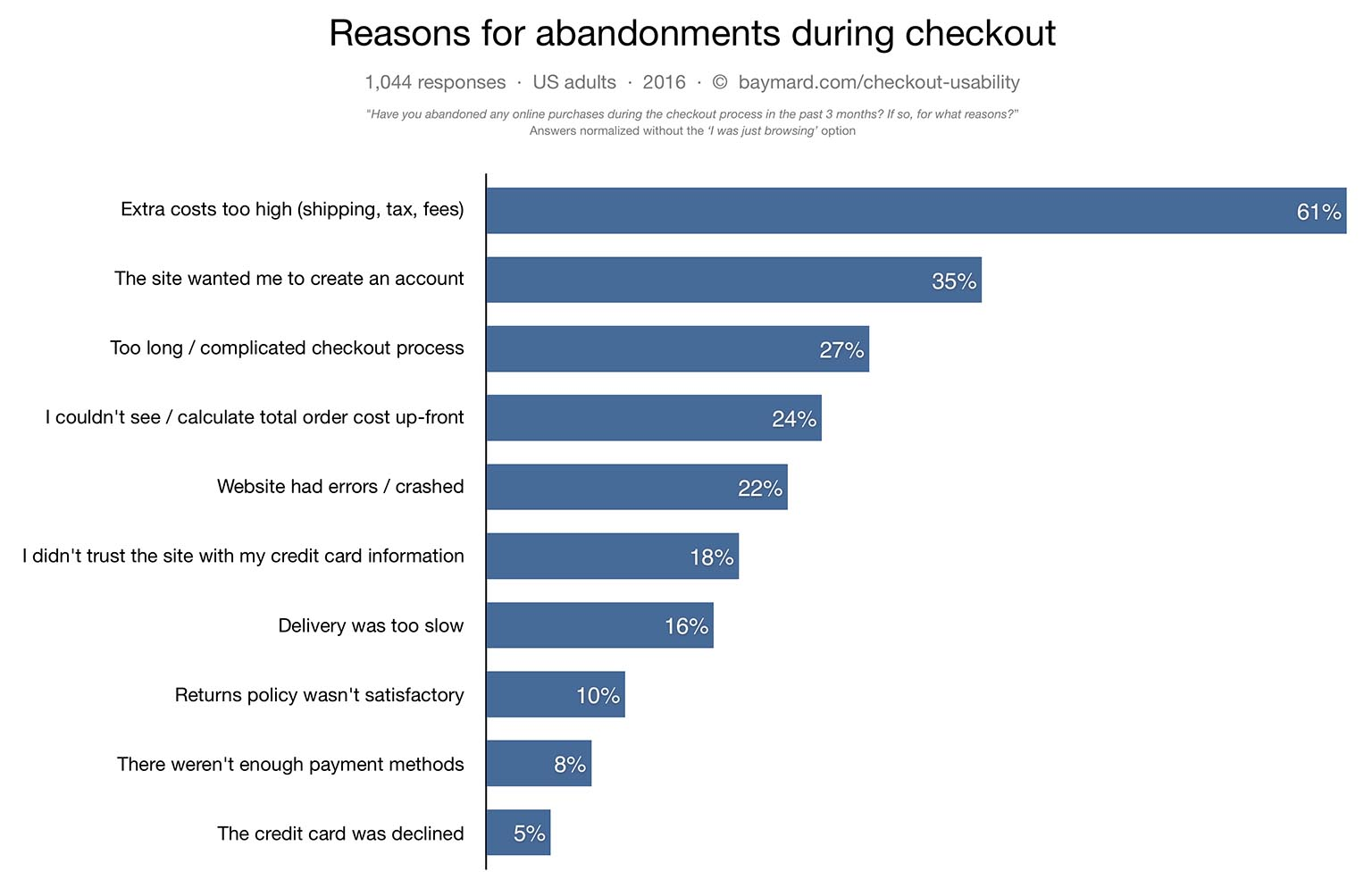
Fortunately, this is a worry that is really easy to address – just as long as you’re willing to be transparent.
11. Display extra costs early in the checkout process
For example, even if you are forced to charge extra for your products or services, you can still ensure that your users know that it’s coming. Grailed, for instance, has a handy shipping calculator right on its product pages. It’s an excellent tool for helping web visitors get a clearer idea of how much an item will cost.
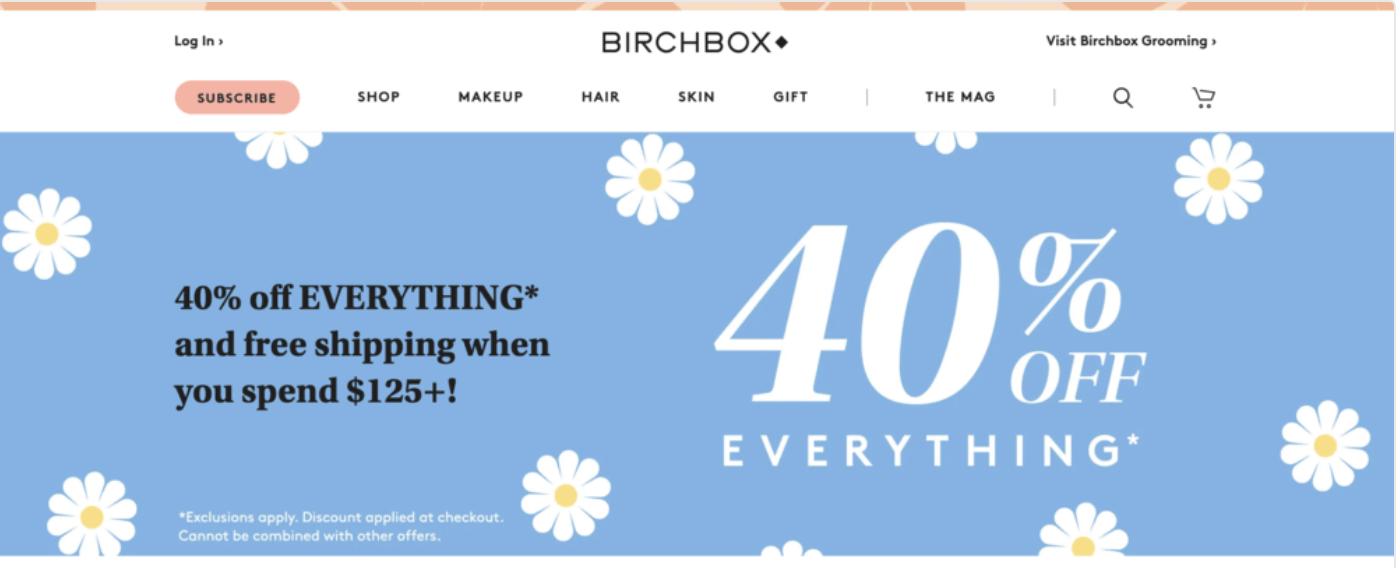
12: Highlight free shipping and special offers
It’s proven that free and fast shipping plays a crucial role in consumers’ decision-making process. Knowing this, it’s not a bad idea to emphasize it if your ecommerce business offers it.

You can easily do so with a website banner, like the one used by Birchbox.
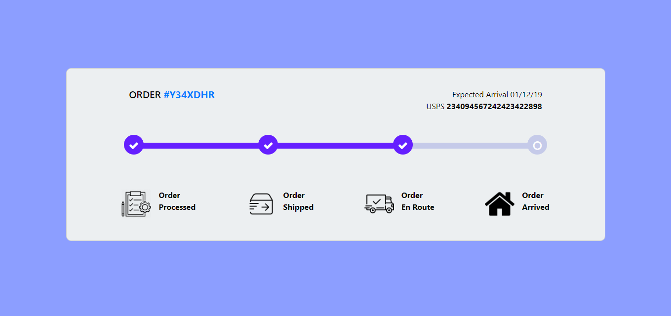
Will I receive the product I ordered?
In 2020, over 5 million people in the UK had a package lost or stolen. And things are even worse in the US. According to C+R Research, 43% of Americans have fallen victim to package theft, and 61% know someone who had a package stolen.
With this in mind, it should come as no surprise that people are hesitant to buy online. Especially considering that there’s almost a 50% chance they won’t receive the items they’ve paid for. One effective way you can address this fear is to inform users about how you’re making sure that your customers get their ordered items.
Do you offer order tracking? Make it known on your website. Can your customers upgrade to insured shipments? Add a checkbox they are guaranteed to see.
What if I don’t like the product?
Finally, if you’re looking to address buyer fears to maximize conversions, don’t forget that, sometimes, people simply won’t like the products they get.
According to Invesp, at least 30% of all ordered products are returned every year. And shoppers know that there’s a great chance that they won’t like the product. That’s why 76% of people prioritize free returns when making purchasing decisions. So, to ensure that your sales are not hurt by this fact, try to instill confidence with a few effective strategies.
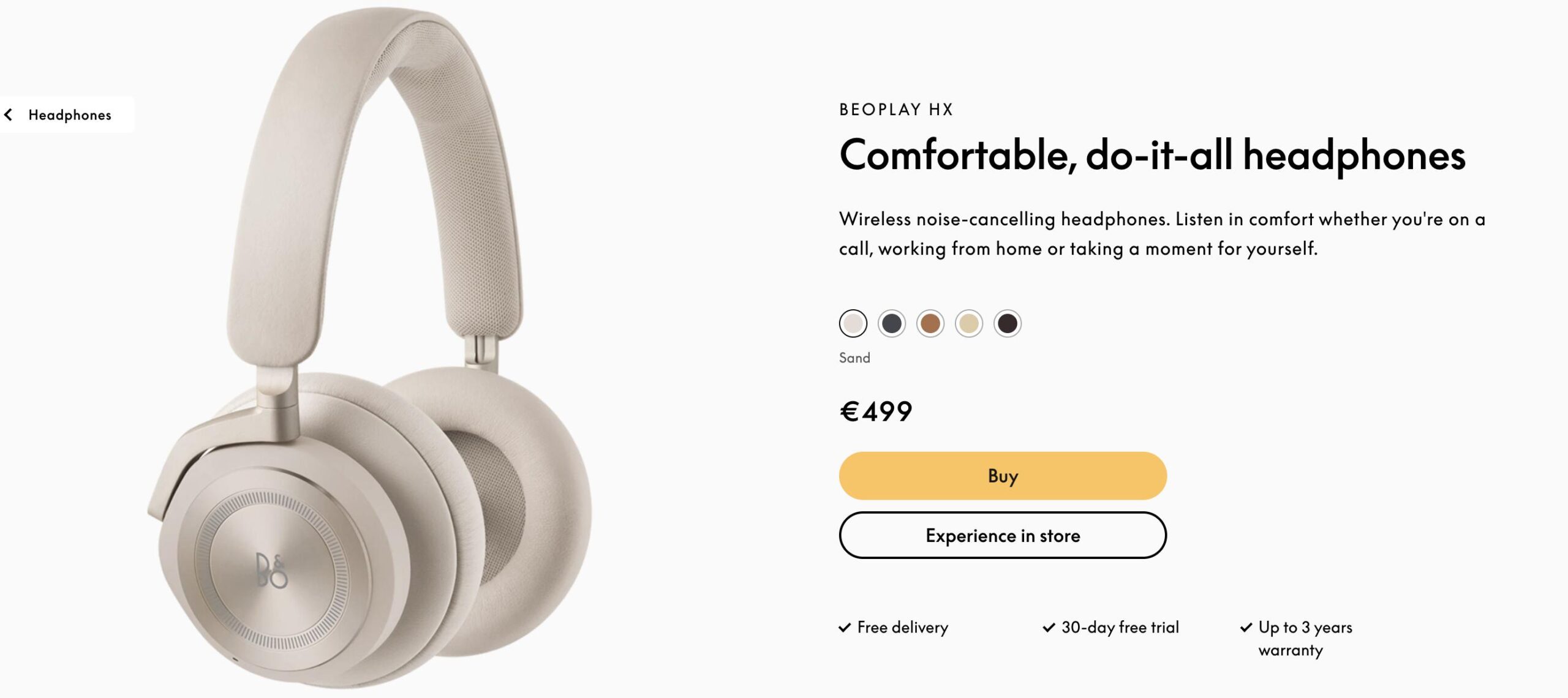
13: Use a money-back guarantee icon
The first thing you can do is display money-back guarantee icons on your homepage and product pages. Bang & Olufsen does it with a “30-day free trial” icon that’s easy to understand.
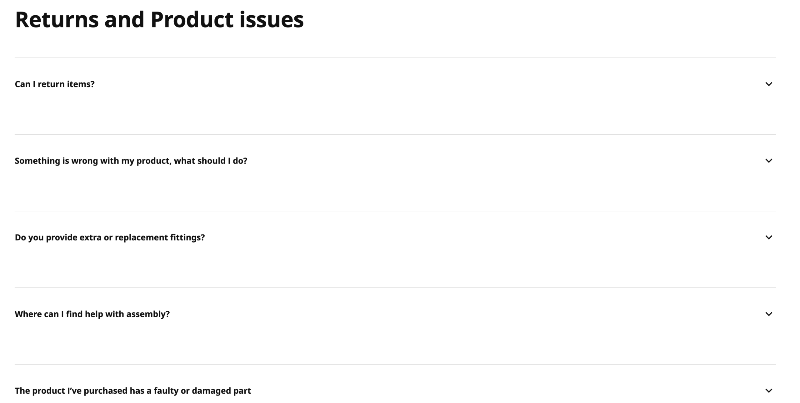
14: Brush up your returns policy
For a slightly more advanced method, don’t forget to go through your returns policy. You want to ensure that it’s both informative and easy to understand.
For a great example of a brand that does this, check out Ikea. Their FAQ page provides plenty of valuable information for customers looking to make a claim.
Final thoughts
As you’re well aware, encouraging web visitors to convert is no walk in the park.
After all, that’s why the average ecommerce conversion rate falls at around 2%. Nonetheless, there are simple and effective methods you can use to avoid buyer hesitation.
As you embark on this journey, try applying the methods we’ve talked about. But, most importantly, don’t forget to listen to your audience. Consider whether any questions keep showing up in your inbox. Go on social media to see what frustrations people have with your competitors. Chances are, you already know what it is that’s stopping your web visitors from converting. So make sure that you listen to the data and take a proactive approach that prioritizes customer experience.